Showing posts with label comics. Show all posts

Monday, November 5, 2012

R3VI3WZ!! (of Comics) | Saga Vol. 1

Written by Brian K. Vaughn, Art by Fiona Staples
 THE RUNDOWN
  • Space is a big, scary place.
  • Human-Animal combination animels are the best kind
  • FEMALE ARTIST.
  • Concept, you're doing it right!
Comic books are a weird thing, it's so much series to create a new kind of story, an original set piece that could be inspired by different predecessors or contemporaries, but ultimately a creator is making a new kind of story to introduce into the plethora of content saturating the modern comic book market.

And yet, with the power of the Big Two driving most of comic book sales, we have cross-overs, team-ups, cameos, company-wide events, relaunches, reboots, ret-cons, and a ton of other tactics to keep these ninety-year old franchises alive. Well, cause they have too -- there is no world without Superman or Spider-Man (just accept it).

So when a guy like Brian K. Vaughn comes along, or a guy like Robert Kirkman, hash out crazy successful series like Y: The Last Man and The Walking Dead, it's a blessing. Image itself has become one of the indie publishers that get right into the new content to tell audiences, which I am so glad for. Today, there's even more presence of original series not associated with preconceived franchises than ever before. It's such a breath of fresh air for comic book fans. And here's where a story like Saga comes into play.

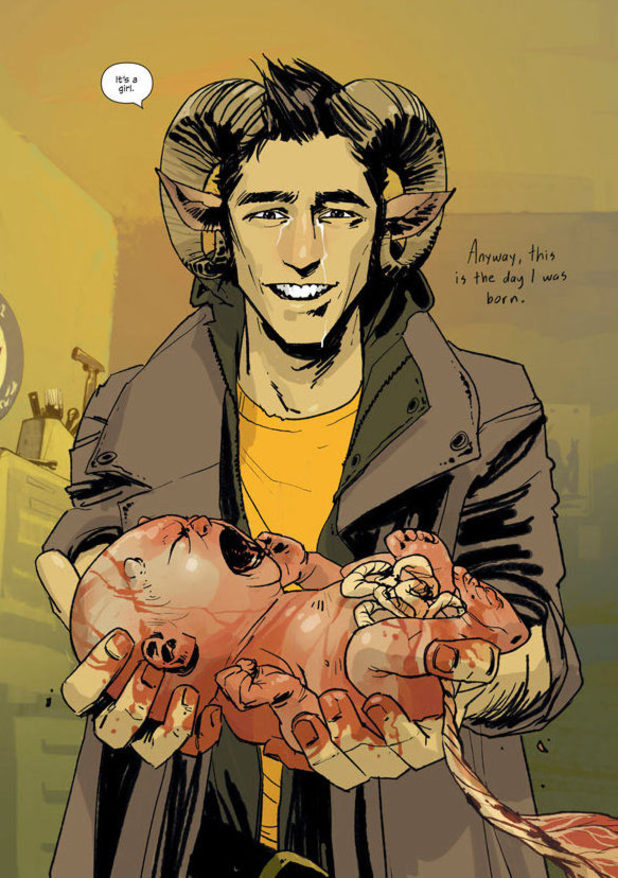
Vaughn's second big project with artist Fiona Staples is a space epic set against the backdrop of inter-planetary war, though it's technically not, between a planet and one of its moons -- both civilizations are locked in conflict that is heated and never-ending. Unless, a solider on one side and a prisoner on the other end up falling in love and having a kid -- then things get complicated.

The premise of Saga itself is a complicated and nuanced experience. There's a huge reliance on close, human themes amidst an insanely high-concept story world. There's robots, bounty hunters, royalty, secret agencies, magic, wings, horns, and a mixture of genres that dips its toes into everything it can. And it comes out a cohesive read. Brian K Vaughn's conceptual ability is something to be marveled at, and without a doubt, respected.

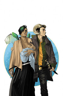
He ties it together with two central characters that jump off the page immediately -- from panel one. Strong characters are a glue that can hold even the craziest concepts together, and the read gets only more enjoyable form there. Alana and Marko are two backstories that couldn't create more inherent drama even before hearing and seeing them -- they are the proverbial 'star-crossed lovers', only one is feisty as hell and has insect wings on her back, and the other his a horn-bearing magic-wielder who gets into fits of rage when those he loves are put in danger.

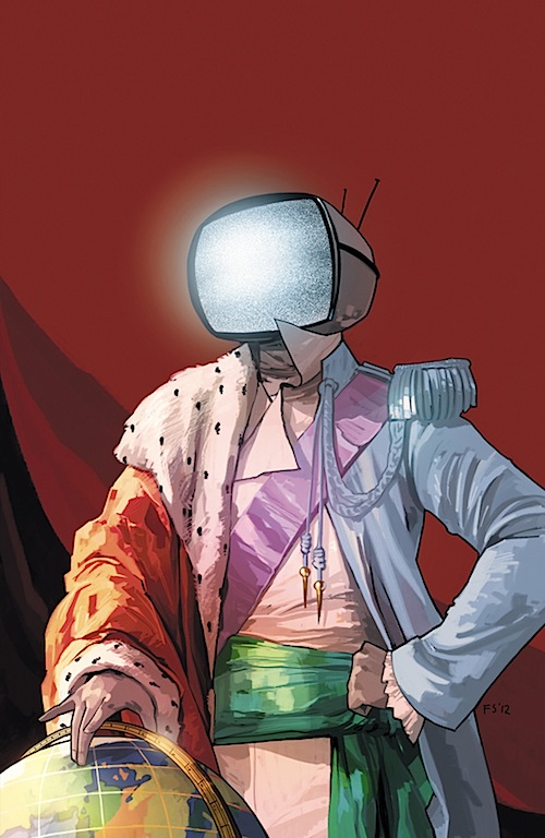
If anything, read this book for the cast alone. I love how Vaughn and Staples have gone the route of character designing these foreign worlds in the human form, not only to bring the themes into more relatable territory, but it's just refreshing to see a unique take (ironically, consideirng they're more human than alien) of extraterrestials. It places the plotline in a weird place with these almost-human characters encountering noticably more alien experiences. But a supporting cast of weird-ass bounty hunters and robots with television screens for heads just adds to the intensity of Vaughn's world.

BRASS TACKS: THE VISUALS

Fiona Staples is quickly becoming one of my favourite comic book artists. The fluidity of her linework and how casual it all comes together, not to mention doing the coloring for the first volume as well, is a huge selling point. One could demand a visually overwhelming, double-page spread kind of sci-fi book to boast the story world Vaughn's created, but Staples kind of goes in another direction.
All of it's loose and light, and yet it still jumps off the page. But when those spreads do come, Staples manages to piece together some outstanding images that stick in your mind long after you've turned the page. Her command of movement and pacing in those key action sequences -- trying to wrap your head around armed battle mixed with medieval-style magic in one page is pretty damn hard. But for me, I was stuck on certain pages, finding detail that I would have missed if I didn't browse the goods. And there are a lot.

The last thing that should sell you on this book if nothing else, is Staple's cover art. Of this particular volume, it's just beautifully designed. Simple as that. It puts Vaughn's incredible characters in the centre to pique the reader's interest, and the title and background give enough hint to what a reader can expect. And it's just super pretty too look at.

Note: Female artists in the comic book industry deserve this kind of recognition. Cause they're out there and comic book fans have to motivate more female artists to try it in the industry. It's been long enough that we've either unintentionally, or more disappointing, intentionally ostracized an entire potential audience. Support female comic book artists and writers!

THE VERDICT

The price tag on this awesome book is a measley $9.99 at your bookstore or comic book store. This isn't even a debate. Vaughn and Staples are sacrificing the revenue stream for more of a readership motivated to pick up a brand new property from an independent creative team. This is the definition of bang-for-your-buck. The story is fresh, it's rejuvinating and it captures you from page one. The art is pristine and flows in sync with the storytelling extremely well. The story world is one to marvel at. And it's only $10. Go get it, read it, and follow this book because it's going to blow up very soon.


Saturday, May 26, 2012

!!SWEIVER (of Comics) | Justice League Dark #9

Fuck science.
Written by: Jeff Lemire
Art by: Mikel Janin
Colors by: Ulises Arreola
Cover: Ryan Sook (his covers rock)

THE BASICS:


- Fresh start, fresh team.

- Snarky lead character = fun.

- B-Listers everywhere, and they rule.

- First layers being peeled back to...

- Something pretty big.

RUNDOWN:


I've been picking up weekly issues of Justice League Dark since #1, and more than once I've been back and forth of whether to drop it when some of the weaker stuff was released under Peter Milligan's writing. But Milligan had a decent run with the cast of characters. When you throw in magic-based heroes into a team book, the chances are there's going to be some uniqueness by default to the kinds of stories that you can tell. DC's huge focus now, on tying every ongoing series into another one, made Milligan's run a bit cluttered in the later issues (never picked up I, Vampire after its #1, though I continue to hear good things).

#9 is a fresh start with Jeff Lemire at the helm the writing chair, and coming off Animal Man already been proven to be consistently amazing, I was stoked for this issue to bring back some flavour to the cast where I felt Milligan ended up dragging down as he did his run (but a good finish with #8). Lemire hits the ground running, and wastes no time changing the series' attitude and ton as a whole (definite visual cues to Indiana Jones). The tone's a bit brighter, a bit more adventurous rather than the previous doom-and-gloom, horror-style plot. The biggest plus here is how he handles Constantine's characterization. The snark is there, it's clear, and its wonderfully played off of from everyone that Constantine talks too. A clear lead is established, which is great. 

There's really only one new addition, and a nice cameo too that shows DC's devotion of their long-term plans on how this entire universe, magic-based and the bigger one both, will be important in the future (if you picked DC's New 52 issue on Free Comic Book Day). This issue has the virtue of being a fresh start after the 'testing phase' of how to handle this "Dark" line of books, and the feeling of having no time wasted in connecting the necessary dots makes for a swift, fun, and fast read.

The villain for this issue, Felix Faust, gets a nice revamp, and how Lemire incorporates the obscurity of the magical aspect of the DC Universe gives me a feeling that his run is going to be a window into how expansive this branch of the larger world we can get -- great for new readers, and fun for guys like me who scrounge DC's wikia for all information about the most obscure heroes and villains.

Hitting the ground running was a key part in making his book work -- Lemire's got a good sense of where this story is going, and as a result, these characters work together better than I think Milligan wanted to get them across as. The aspect of 'reluctant non-team guys' felt hammered by the fifth or six issue for me -- this time, I'd rather see them working as a team, but they still get to keep that dysfunctionality as a collective personality quirk. Which is neat. For me at least.

BRASS TACKS


Mikel Janin is what caught my eye initially about the JLD. Wouldn't call it photo-realism, but that style he has is noticeable and eye-catching. From issue to issue, the detail he puts into facial expressions and textures, including the bold pencilling which is a neat contrast with the naturalistic features, is a great reason to come back. Yet, I feel like it'd be the sort of style to get Greg Land-ian criticisms of tracing photo references and the such, but fuck those people.

For this issue, I don't know if its colorist Ulises Arreola that's bringing something new to the table, but Janin's art's been tweaked just a bit to make a noticeable change to those wh-o've been following. But for new readers, it's the same reliably details and rich Janin artwork. Distinct characters are drawn with care and clear separation of personalities is reflected in each of these guys. Constantine's expressions alone are always a reassuring sight, there's probably ten little different ways he lights a cigarette between #1 and this issue.

Another bonus is how he takes Black Orchid and Andrew Bennet as new characters, and I especially like Bennet's transformation into his other form (go read I, Vampire, it's pretty good). I'm a sucker for cool character designs, and I love the visual take on Orchid's shape-shifting. It's the little nuances in detailing that Janin, and artists in the vein of his style, give for readers. Definitely worth another read just to scan the panels for the little things. 

Combined with a fresh writing direction, a polished tweak on how Janin's drawing it to reflect Lemire's story-- it's a bit rougher, sketchier overall--is something I'm thumbs up for.

TAKEAWAYS:


A great starter book for returning readers, or new ones who just want another Jeff Lemire book in their collection. While not amazeballs brilliant, it's swift exposition to set up a grander story, some delicately played-out magical combat and montage action that makes it fun and exciting. Magic lovers rejoice, there's new spice in the life of John Constantine and company. 

Lots of backstory, lots of speculation, and a shit-ton of sorcery. And a great cast of characters that have a lot that can be played with, especially in this creative team's hands. Can't wait to see how the team incorporates more magic heroes (cause there's a ton). Gonna get stoked for what's to come.

Thursday, February 16, 2012

ReV13WZ! (of Comics) | Batman #6

imageWritten by: Scott Snyder
Pencils: Greg Capullo
Inks: Jonathan Glapion
Colorist: FCO

THE BASICS:

- New villains, old presence. And Owls. 

- Trapped underneath Gotham City.

- Delusion + reality, which one’s which?

- Batman faces death…again.

- Plus: this cover is terrifyingly amazing.  

RUNDOWN:

Wow, what a comic this has been so far. If there’s a proper way to write Batman, Scott Snyder’s probably nailed the formula—hell, he probably invented a new one. At the rate he’s going with the character, he could redefine a lot of things about what Batman really means as a book and as a superhero.

If you haven’t read the first five issues of the current Batman series, you are missing out on some grand and disturbing storytelling. Snyder and his team have definitely moved away from the traditional way Batman is portrayed into some psychopathic reality-bending horror fest that pits Bruce against his own sanity. And it’s lovely. image

No spoilers allowed, because I want you to read it but: the new set of villains that Snyder’s introduced into the Batverse are a doozy. I don’t read a lot of Batbooks and I’m not his biggest fan, but nothing like this has been done for a while to this scale. Organized crime syndicates sure, but the balls on these guys now three issues in—and by the fifth, as the previous issue, it’s balls-to-the-wall fucked up.

These bad guys will tickle your fancy, and Snyder following up last issue’s unmatchable story, matches it with this one. The entire set-up has been for this issue, and the constant disadvantage that Bats has been set with loses ground, and the pacing of this issue is literally him crawling up from the deepest of dark places and fighting back with all his might.

And I think Snyder’s direction with Bats’ character is to bring an emotional core back to him rather than just a representation of strict morals and due justice. That’s all blah-blah and constantly gets dished out with countless Batbooks—this is different.

A major theme so far in the first six issues has been the identity and soul of Gotham City, rather than just a place, it has its own atmosphere, its moods and its defining emotional qualities, and Bruce is intensely tied to the city he protects. So the Court of Owls—these new guys, come up as a secret society that’s been hidden from everyone, including Bruce, and he’s not gonna be happy.

It’s played with wonderfully in the previous issues, and again, it all bubbles and festers to the top with some jam-packed action, slick fight scenes, and some of the grittiest artwork you could have for a Batbook, and that’s saying a lot, thanks to Greg Capullo and Jonathan Glapion.

BRASS TACKS:

Technically, Capullo brings that distinct drawing style that automatically adds some personality to a book. By issue six, I’ve grown accustomed to those harsh edges and angles that permeate through soft backgrounds and locations. Faces are lively, but rooted in a sense of grit that matches Gotham’s architecture and its atmosphere. It’s a lovely look if you dig stylized characters, which I do.

imagePlus, violence is done so beautifully here, and especially the past few issues. You can feel the pacing of the fights, it’s like a visual crescendo with each panel punching into the next. It’s a hell of a ride. And Capullo I’m guessing is loving the fact that he gets to detach from realism for this book and really delve into Bruce’s psyche (which takes a beating in this storyline, read those other issues) with consistently nasty, brooding, and grimy takes on what it’s like to be in Bruce’s perspective. There’s a full-page that really brings it home for me, it’s great.

FCO’s colours—I’m liking the visual theme he’s got going here. If you read it, you’ll notice a consistency of black and whites, dully greys peeking through, and an emphasis on lighting, or lack thereof. Shadows and darkness are key. The thematic implications are full to the brim, it’s a great compliment to Snyder’s story. This time, the Batman is not the one lurking in the shadows. Awesome.

TAKEAWAYS:

Read this fucking comic. It’s going to be award-winning. Batman’s never—and I mean NEVER been done this way with such conviction and efficiency. If you think you know Batman, you’ll change your opinion for the better with this one. If you don’t know Batman, you’ll be meeting the best version yet. If you’re like me and really need a reason to like Batman, then this is definitely it.

That’s something for everyone, inside one comic book. That’s skill.

That’s Batman #6. GET IT.

Friday, February 10, 2012

ReV13WZ!! (of Comics) | Batwoman #6

Expect a lot more of this in the future.

Weekly recaps of favourite comics alongside movie reviews of new and classic sci-fi, fantasy, or the geeky-related, in-depth television schpeels, and roundups of any new content floating around in the ether that catches the eye of this blog will be featured, just for you.

 
My hopes are, the more content I put up, the more you’ll care about this blog, and the more people you’ll send this too. Also, for me to get better and talking about things I like. That’s always good.

----------------------------------------------------------------------------------
BATWOMAN #6
Written by: W. Haden Blackman & J.H. Williams III
Pencils: Amy Reeder | Inks: Richard Friend & Rob Hunter

imageThe sixth month of DC’s “New 52” publishing initiative is calling for some lineup changes to keep things fresh. One of the bigger stories was with Batwoman, mainly because William’s artwork for the series is up there at "challenges fine art” level and we get to see how Amy Reeder, a cult favourite especially among female readers, fares in comparison.

She did a damn fine job. I’ll get to story in a minute, but the big pull with this issue other than being the guest artist is that readers want to know how her art’s going to play out for the book—the visual style may be completely different, but reading it evoked the same grit and grime on one page, and fullness and lush expressions on the next. William’s proved that he can be diverse, and Amy’s followed up with her own signature take on that.

What stayed consistent, I think, was Guy Major’s flat colours that dominate most of the pages, transferred from Williams’ work on the previous five issues. The distinctive look of Batwoman’s costume, chalk-white skin, and burning red hair (you can tell from the cover) haven’t been tampered with. Reeder’s art team respects Williams’ take with convincing devotion.

What enticed me was an entire change in pacing, structure, and especially panelling. Right here I should mention that this is a a whole new story arc, so a great jumping-on point if you want to get into a great character, and a great Batbook. It’s a mulit-plotted read, with Kate (Batwoman’s secret identity) at the center of it, and like a puzzle, it unravels for us with each panel. There’s a mix of static, nuanced character moments for each of these plots, against imagesome beautifully rendered action to balance it out. Motion is a big part of this issue, Williams and Blackman gave Amy an opportunity to flex her anatomical muscles—the movement here is great.

Content-wise, I’m pretty hooked. This new plot comes straight off the last one with the new Weeping Woman villian, a self-contained story—but like the ghostly, mystically fluid powers Batwoman had to battle with, it sends ripples outwards to the beginning of this plot. And, above all, what anyone would like about any good Batbook is that there’s some investigating involved, albeit in a non-linear fashion this time around. And that’s not a bad thing at all. 

So, amidst DC’s shuffling of creative teams dominating the scene right now, Reeder’s addition to Batwoman met, and probably exceeded everyone’s expectations (a very tall order). And if you didn’t have any beforehand, then great, this is a book with great art, great story, and most of all, amazing character. There is no other superhero like Kate Kane out there, at least not of her calibre. Guarantee that. 

Lots of people work looking forward to this team-up, and Amy Reeder’s proven in twenty minutes she knows the book like the back her hand. She better stick. Williams is showing his capabilities as a artist-turned-writer (along with Torontonian superstar Francis Manapul on Flash) and the whole creator line-up is just poised never to fail.

It’s one of the best superhero comics out there right now, and it shows no signs, even when new guys are put into the mix, of stopping anytime soon. Pick this issue up.

Monday, January 16, 2012

Tuesday, December 13, 2011

A Case in Pride

I’ll sound like a broken record soon, but time and time again I encourage most people I see to start reading comics and graphic novels. If there’s at least a hint of interest in simply reading, as in prose fiction, the threshold of picking up a comic book, or a closed graphic narrative, is not far away.

And as the dwindling demand of mainstream comic books is seeing its decline, probably the earliest one to go in the slow, steady, inevitable decline of all print media, I’m concerned.

Losing comics is like losing an entire language—no, imagine losing television. Losing cinema. Losing plays. If that was gone from the combined cultural context of a society. The worst case scenario is, in the 5,000+ year history that sequential art has existed on Earth, that it’s going to die out because of the social contexts and mass preconceptions and the pop-culture pothole it can’t seem to get out of.

The cynic in me broods, but I have high hopes. Despite the marginal attention it gets in its actual domain—minus the adapted properties other mediums suck out of it, providing no aid in pushing a potential consumer base into the works that inspired such properties, I have hope that comics may survive—nay, thrive, if it can climb its way out of those social and cultural barriers it’s been trapped in for the last 20 or so years.

I just finished reading Understanding Comics by Scott McCloud, a cartoonist and a comics theorist—yes, I consider it an actual term, like it deserves to be, and the things it taught me about the medium—the artform—is that there’s way more importance to what it has to offer and and what it provides to the literary world than I originally thought, and most likely more than anyone of my peers or elders think.

It’s a great textbook, a great study and a great tool. If you have any doubts picking up a comic, whether for the potential self-ridicule or judgmental peers, this book quells those anxieties. It made me feel privilege to be a fan, a participant, in the medium of graphic storytelling. It’s a special kind of medium. Like no other.

So, in wondering why there’s not more attention to it, I tried searching for any kind of academic presence towards the medium, because I know old professor-types still read comics no matter how sophisticated they want to seem. Hell, some may embrace it.

Like this guy.

Henry Jenkins – “Comics and Graphic Storytelling: A Sample Syllabus”
He teaches at the University of Southern California, and his students are lucky.

There are programs at SCAD that teach sequential art, and may art schools around the world also offer sequential art programs of study or related courses, which is awesome—no matter how small it is, the comics industry and consumer base will always look for, and find, new artists, inkers, pencillers, letterers and the like.

But teach the academic worth of comics and graphic storytelling as a literary medium, as far as I can tell, is a far-off dream. At my school at least, no such courses exist, sure they may be touched upon by professors who want to spice up their syllabi with ‘fun’ comic book topics. Most pop culture courses refer to comics of staples of Western identity, but most of the time it ends there.

Where’s the deconstruction of Alan Moore’s iconography and character symbolism in Watchmen? Art Speigelman’s mastery of storytelling craft with Maus? The superficial beauty and representation of intimacy through line, shape, and panelling in Craig Thompson’s Blankets? The history and source behind the cultural contexts that characters like Superman, Batman, or Archie provide?

Not in textbooks your school makes you buy, that’s for sure. Jenkins in his proposed syllabus provides Understanding Comics as required reading among Will Eisner’s great Graphic Storytelling & Visual Narrative (that inspired McCloud’s book), and a great sort of graphic novel examples: Batman: The Killing Joke, Persepolis, The Unwritten.

If these names are new to you, Google them. Now. Learn. Teach yourself. Indulge in this medium, for the sake of its preservation and cultivation. So you can read comics in a classroom, and no one is allowed to be ashamed, because there’s no reason you should be.

Maybe, put down the Hemingway and the Plath and the Dostoyevsky and pick up some Alan Moore, some Grant Morrison, some Charles Shultz.

Just pick up a damn comic, and be proud you’re reading it.

The schools might follow suit.

Thursday, November 17, 2011

EPIC Game Trailer of the Week

Ultimate Marvel vs. Capcom, following up the vanilla release a few months back, included a new roster of additional characters for both sides.

The game’s been out for a while now, with those additions wilfully ready for your fighting pleasure.

I could talk about how well-crafted, simplistic, and conceptually awesome this trailer is, but my mind can’t even comprehend what I just saw.

DEM MATCHUPS. DAT EXPRESSION. DEM FIGURES.

Excuse me while I go change my pants.

[via theawesomer]

Saturday, November 12, 2011

Green Lantern: The Animated Series (2011) | Review

It’s a damn good month to be a geek.

Along with the assload of amazing video games releasing/released this month, and the New 52 still going strong from DC’s print side, the televised world of geekiness has steam running in its engines too. If you hated Green Lantern movie like I did, and looking for some redemption, or just some faith that the property isn’t completely dead after that debacle, look no further.

This is the review of Green Lantern: The Animated Series’ first sneak peek.

image

Green Lantern: The Animated Series, Episode 1x01 “Beware My Power”
Directed by: Sam Liu, Rick Morales
Written by: Jim Krieg, Ernie Altbacker
Executive Producers: Sam Register, Bruce (fuckin’) Timm

I actually chanced upon the season opening, thinking Cartoon Network shows wouldn’t be automatically syndicated over the border to Teletoon so I could set aside my time to catch the entirety of the show. Fate would have it that I’d watch it anyways, and it glued me to my seat until the credits rolled.

This is a new kind of cartoon. Not just a superhero cartoon, a cartoon in general. I’m making a bold statement because this is a bold move by both Warn Bros. Entertainment and DC Entertainment, to venture so far up into the space of wild creative ideas without tethering it in whatever’s been half-working for the network executives and higher-ups. Now, I don’t have one tiny particle of an insider look at what’s going on at the roundtables and the board meetings, but hell, the final product shows us something—things are changing for weekend children’s television.

Because of my late entrance, shameful, I know, I didn’t catch the first few minutes, but when I did flip to it, it seemed pretty much already in full swing. The show centers around everyone’s ‘favourite’ Green Lantern—Hal Jordan, ace pilot, sometime jerk-wad, cocky-yet-goodhearted star corpsman of our wonderful little 3,600 strong space force. He’s already an established character within this universe—it’s not a coming-of-age tale. Considering what didn’t work with the Green Lantern movie, there really wasn’t any other way to go.

image

Rudimentary comic book knowledge aside—if you’re a complete newbie to the Green Lantern mythos, or comic books in general, you won’t have problems with this. This is a condensed, approachable series from the get-go. That’s reflected in both the visual elements and the narrative ones, at least from this pilot episode. Given the projected demographic I’m assuming they’re trying to reach, maybe somewhere around 12-18, that’s a necessity to do this in order to hold onto those viewers I think they’ve indeed hooked in with this premiere.

Down to the nitty-gritty. As the plot in this pilot goes, Hal along with hardened, no-nonsense drill sergeant Kilowog choose to investigate a missing Lanterns case out on the fringe sectors, despite the threats of reprimand from the Guardians of the Universe (their bosses). From there, the narrative trajectory is straightforward for older audiences, but for the kid in all of us, it’s still a thrill ride from the start since the villains of this episode are featured prominently in the opening sequences.

image

Here’s where the backstory kicks in that propels this into an ambitious endeavour. These guys are Red Lanterns—a ‘Lantern Corps’ that only recently appeared in the Green Lantern publications by DC. These are new ideas from comics being translated into television. Hyperaccelerated creative syncretism. The television industry is rigid. This doesn’t happen often. But, the creative minds behind this project—Sam Register (one of the big guys at DC animation) and Bruce Timm (the Stan Lee of DC’s animated properties) propped these characters up as golden for the show.

Boy, were they right. Not only do the concept of Red Lanterns fit perfectly and easily into the structure of the plotline, they retain their thematic value from the comics—for the hardcore fans, that’s major points. They seem natural, even if we’ve never seen them before on the screen. They’re even new to the Green Lanterns who first battle them, Kilowog’s on the same boat as the audience is. But he’s intrigued by these raging, blood-vomiting vengeance seekers, and so are we.

Most of the debate beforehand came from the approach that the animation style was way improper for the content of the show. After the impact of Justice League, helmed by Bruce Timm in the early 2000’s, his set style as lead animator paved the way for all comic book animated properties to follow. With this foray into CGI, heads were shaking. I can see where they’re coming from, but the argument me and many others have made in support, is the ‘why not?’ aspect of it.

image

If this is Green Lantern, the source of their power is two-fold, willpower to wield the green energy in their rings, and the imagination required to utilize it. GL’s can create anything with their minds—it’s all just light from a ring. In a 2D world, sure, that would look fine—but Bruce Timm’s already done 2D worlds, three times over. The change is a chance for the team and for this show. The producers consciously decide on this creative direction because it’s a way to separate and diversify a visual style.

But most people just want a pretty cartoon. Well, for you guys, it’s sleek, polished, and clean. The influences from The Incredibles and  stylistic throwbacks to early CGI like Toy Story, as my friend compared it to (although with negativity attached) aren’t attempted to be hidden behind embellishments. It’s simple and shiny. It’s Timm’s style made into three dimensions, and the eyes just have to adjust a little.

image

image


This is seen in those character designs of our two other, non-comic Green Lanterns that act as the plot points that push the story forward. This is where the writing comes in and adds a layer of sophistication that’s desired so much as a formula for success. The fast version: they have depth. They’re not beats on a script for our leads to have something to do. The story pushes character development for everyone, including these ‘one-offs’. They mean something by the end, as characters, and not footnotes.image

If you watch the episode, it’s an easy feeling to grasp onto—they’ll feel like more than caricatures, or mock-ups of what the other, more important guys feel like. They’re peers, not sideshow acts. They’re Green Lanterns, damn it. And as a result, it feels like a bigger universe ready to be explored in the future. Kudos to the writing team on that one.

Diversity in character weaves in with diversity of design—those alien looks are the traditional varied humanoids you’d expect from a space opera. Bottom line is, it’s cool—that should be one of the reasons you come to this cartoon. It presents itself within this visual style with elegance. Nothing’s overtly wonky with design and the look—static or moving. The digital lighting effects add those touches of detail, but their soft and implied, the presence is on the shapes and figures.

image
The animation side of it is the shaky area, you’d think, it’s handled beautifully here. The scarcity of detail in the look of the whole thing is an opportunistic decision. It allows for swift, fast-paced action that hits hard and keeps hitting, because our eyes don’t have to wander too long. It’s easy on animators and pleasing to my eye. The clean-cut nature of it allows for denser, faster movement. And with the fact that these are guys using mind-made hard light weaponry, the cleanliness is a treat.

Plus, the believability of the whole thing is stemmed into the performances. The casting director, a veteran at the studio, casted it perfectly. The actors working on this are established (Lucius Malfoy among them), and their voices work synonymously with the animation. It’s probably my favourite part of this episode—having voices that fit the character. They sound like that in my mind when I flip through comic pages.

These guys aren’t scared either, or safe or cautious—like I said, they’re bold. They’ve introduced new characters, thrust viewers into an established world that they’re confident they can craft for us, and used the mythology cleverly enough that it works despite the preconceptions. That should get some respect.

Then again, these are super-experienced, seasoned veterans at animated television tactics, with a double major in superheroes and awesome. Why would they do more of the same? They’re pushing boundaries, getting new viewers, spreading awareness, and coming up with new ideas.

It’s a excitedly fresh move from these producers, and I’m down. I’m so very down.

“Beware My Power” can be found online everywhere, soon probably. The rest of season will commence Spring 2012. So you have lots of time to brood and reread this to convince you ten times more to watch it. Just you wait.

In brightest day, motherfuckers.

Sunday, November 6, 2011

EPIC Illustrators of the Week

Kevin Wada has a knack for combining the elegant with the awesome to create a pretty stellar take on our favourite X-Girls. Kitty Pryde, Emma Frost, and Mystique below.

image

image

image

There’s more at his art blog. He takes on many recognizable ladies from the X-Universe and retools them into chic supermodels with some clever visual references to their looks in the comics. Neat-o!

Round 2? Max Wittert who takes another stylistic direction with his depictions of the X-Ladies. Equally high-end and chic, but a very different look. Tons more at his blog.

imageDazzler is dazzling as usual. 

imageSix arms? Six times the accessories.

image
Jubilee and her trenchcoat. Don’t fix what ain’t broke.

Any of of these works by these guys could pass off as magazine ads in Vogue or something. These guys are legit fashion illustrators, so that explains most of it.

Who said comics can’t be chic?

[via io9.]

Saturday, November 5, 2011

Young Justice: Season 1 (2010-Present) | Review


image
Created/Produced by Greg Weisman & Brandon Vietti

The resurgence of the superhero genre in entertainment is certainly something to be excited about. Franchises like Spider-Man and X-Men began pushing for more presence on the big screen, while Justice League brought back almost everything that cartoons like X-Men: The Animated Series did for comic book properties in the 90’s. When I was growing up, there were only about three superhero shows to watch, and probably never at the same time.

Then, when the 21st century hit, I’m assuming the creative professionals in the field started to realize there was a market in people like me, and hopefully you. Justice League and Justice League Unlimited carried the weight of having a critically and commercially successful property. Then Teen Titans came along and reinvigorated the range of viewership that a superhero cartoon could attract. They were all great, and I wasn’t even a little kid—well into my teens, and I was still hooked on those characters.

So coming back to the animated comic book universes, after dipping my feet into the actual comic book universes, is a good feeling. To see how everything’s developed since the 90’s when I first got my childhood glimpse into those worlds, till now, when the demand and ability for animation to reach new heights is, well, higher than ever.

The premise of a show like Young Justice isn’t new. Like the names I just dropped above, superhero teams strike a cord with wide-eyed kids and nostalgic comic book fans alike. When the announcements for this series first hit the net, people were either screaming foul, or screaming it’s been done before. Little was there the notion that it could a breath of fresh air. And fifteen episodes in, that’s exactly what it’s become.

image

The show follows a new team of teenage heroes from the DC universe, not explicitly the Teen Titans, and not something you’ve seen together before. The roster consists of Robin (Dick Grayson), Aqualad, Kid Flash (Wally West), Miss Martian, Superboy, and Artemis (Tigress in the DC Universe). Existing on what the producers call Earth-16, as in not the actual main DC Universe, the show features many familiar DC characters amidst a slew of classic villains that the team has faced since their pilot episode.

The problem with team-based anything from a production standpoint is establishing distinct characters that the viewer has to care about, and especially in a superhero cartoon, those characters have to balanced both narratively and with their action. This is where my biggest praise comes to this show. As it’s travelled from pilot episode to where it is now, the character development has been nothing short of phenomenal, and it culminates in the most recent episode, “Failsafe”, which many fan sites, and critics, are citing as the best episode of the season.

When you compare it to a show like Teen Titans, the levels of competency in establishing and fleshing out character relationships is on par with is predecessor. The archetypes are played with throughout the season, keeping it direct and accessible to its demographic, yet there’s enough substance for even older viewers to latch onto. At least that’s how I see it. Teen Titans was aimed at a pre-teen crowd, while Young Justice’s more ambitious visuals and older characters are to attract the more mature teenage audience. With that, the producers understand the necessary steps to take in order to present their characters. They know their stuff.

image

The examples can be found if you dedicate yourself to watching the show. I’ll admit, it’s kind of a rocky start from the beginning five or so episodes, but the over-arching plot and classic cliff-hangers sure do give enough incentive to come back. But, it’s the characters that are at the core of the show.

The voices, while at the start of the season, may seem even grating to some (it did to me for a while), they collectively pull of convincing teenage tones. Each cast member brings a vibe to their voices that helps distinct personalities from one another, that only builds upon the strength of character for Young Justice. They have a pretty good writing team to work from too, including comics great Peter David on board. The plot they’ve hashed out, that recently has finally reared its head, is worthy of a fist-pump, but still, the crew has taken the narrative for this team in new directions.

image

They work with an established universe, and distil it into how a team of kids fighting for validation are slowly becoming the centre of it. It’s the ultimate fantasy for any teen watching it. I find myself now hooked on seeing how they triumph too.

An equally praiseworthy element of the show is the extensive action that it packs into every episode. Again, like Teen Titans, this one’s got its fair share of fights. While the stylistic choices of Teen Titans were very angular and simple, Young Justice finds its stride in the incredible movement it puts into its sequences. And the costume designs are a kicker—they’re a chance to see familiar faces in different outfits—perfect for the comic book geek (stop whining, haters).

image

image

The animation is headed by an overseas production company, MOI Animation Inc, in collaboration with Warner Bros. Animation studios. The combined effort gives, if anything, a satisfactory amount of superhero badassery in showcasing all the talents of the team members, including the antics of the 150+ other characters that have shown up since the premiere.

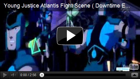
From the episode “Downtime”. Atlantean fight scene. Excuse the lame opening.

The acrobatics of Robin, the dynamics of Artemis’ archery, digital effects showing off Miss Martian’s abilities, Kid Flash’s speediness, and Aqualad’s water constructs are all juicy visual treats that any kid, and any adult, can get down with.

If the witty quips from Robin or the catchphrases from Miss Martian throw you off, their battle sequences will get you back on, trust me on that. It’s got the features you want, and the cameos a show like this needs. There’s something for everyone.

So if you want to ignore the challenge of writing team-based superheroes on television, and that Young Justice achieves its goal in representing them in a way that works (wait till you get to “Failsafe” to see that in action), then the impeccable animation should hook you in for when the series really gets rolling. It’s worth the wait.

This is a show for a comic book fan, or a comic book cartoon fan, if you want to get back the nostalgia from the 90’s or just miss Teen Titans and all its glory. Give it to your kids to watch, and watch it with them cause it will probably hook both parties.

There’s enough in this show to quell the fears of doubters who seem weary for another superhero cartoon, but really, where else can superheroes be successful off the panel? Young Justice is doing its fair share of introductions into comic book universes for potential fans, and that gets my respect any day.

Don’t do a disservice to comics and superheroes and the fantasy of capes, go watch Young Justice.

image

Tuesday, October 4, 2011

DC Comics New 52 | September Pull List

A month later, and the first phase is over. Would you call it a success? Well, every single issue one has been sold out of first printings and gotten back to the presses, and Justice League #1, released August 31 to kick it all off, is going back to a fifth printing. All fifty-two new comic books are going back to second printings.

May not be amazing to you, but it is to me considering the controversy, criticisms and scepticism that dominated online forums, blogs, and comic book websites. How about that DC Comics boycott (pretty sure this isn’t the real campaign, but it’s funny and sad nonetheless)?

Wonder how that’s working out for them.

Just maybe, DC Comics gets the upper hand on Marvel for monthly sales returns. Wouldn’t that be something. In following this entire re-launch from day one, examining all the discussion and dialogue exchanged between retailers, publisher, and audience, it’s a really interesting case study into the sociological and cultural workings of fanbases, and the industry of comics as a whole, both creator and consumer end.

This is just trying to make things relevant. Because I know so many of you care about it. In all honesty though, studying the response on a weekly basis—more than just pulling my books of the shelf and reading them—actually participating in how the audience reaction is taught me a lot about how a niche market operates and how, in turn, are affected by a very specific, loyal, and incredibly passionate consumer base.

Going into detail is for another post. Here’s what I’ve picked up since last time:

September Pull List - DC Comics

Up from 12 to a lovely round number like 20, I’ve added a few ones that have won me over. As well, ones I was eyeing from the beginning for Week 4 of this first month. Specifically:

The Flash #1 – Written by Francis Manapul & Brian Buccellato, art by Manapul.

Superman #1 – Written by George Perez, art by Jesus Merino.

Aquaman #1 – Written by Geoff Johns, art by Ivan Reis & Joe Prado.

Green Lantern: New Guardians #1 – Written by Tony Bedard, art by Tyler Kirkham & BATT (Matt Banning)

Justice League Dark #1 – Written by Peter Milligan, art by Mikel Janin.

I, Vampire #1 – Written by Joshua Hale Fiakov, art by Andrea Sorrentino.

All-Star Western #1 – Written by Justin Gray & Jimmy Palmiotti, art by Moritat.

All-Star Western I just picked up today, because there were literally three of DC’s new ones left on the shelves at Silver Snail in Toronto today. Sad to see Aquaman sitting lonely in a corner, but what can you do, slow and steady wins the hearts of haters, I hope?

Speaking of Aquaman, that one I will definitely be talking about soon. All-Star Western was a gem, can’t believe I passed on it till now. Sleeper hits like I, Vampire, and earlier released ones like Batwing deserve some praise (considering the controversy surrounding Batwing’s author for his other book).

There’s still 32 more, but unfortunately I’ll have to cut it here for the month. The three issue ones I never got a hold off cause I was late to the game—or rather the comic book shop, were DC Universe Presents, Wonder Woman, and Detective Comics.

The others I’ll still read, but necessarily in the most supportive of methods.

Big pile of comics on my desk makes me a happy fanboy. Reviews to come when I muster up the energy. Really, these are all just really good issue ones.

Oh and, Francis Manapul signed my Flash #1, and drew me a sketch. I bet you’ll want to see that.

Stay tuned. And read comic books!

Sunday, September 25, 2011

DC Comics’ New 52 – Current Pull List

Last Wednesday marked the 3/4 mark of DC Comics’ New 52 Initiative, with their re-launching of 52 all-new issue one comic books introducing both brand new and iconic characters to their line of monthly ongoings.

There’s be debate, there’s been controversy, there’s been a substantial amount of buzz regarding DC’s new venture. For a niche market like comic book fans, this is bigger than World War Three (I hope this is an exaggeration). For newbies to the market of comic books, this is a great start for them to get on, and for others to get the word out.

But they question remains, for a creative medium that I’m hope isn’t nearing its end in the coming future, was it a success?

To fork out four dollars every week to get twenty-five pages of fisticuffs and sequential art may seem like a dollish routine, but hell, lots of people do it. It’s the best way to support what comic book creators and audiences do and love.

So how I have helped? Well, let’s see.

Usually, recognition goes to the writer and both the pencillers + inkers, and the colorists (as represented below) as the combined art teams. Collaboration for the win!

Justice League #1, Written by Geoff Johns, Art by Jim Lee & Scott Bryant.

Action Comics #1, Written by Grant Morrison, Art by Rags Morales & Rick Bryant

Batman #1, Written by Scott Snyder, Art by Greg Capullo & Jonathan Glapion.

Batwoman #1, Written by J.H Williams III, Art by J.H Williams III & W. Haden Blackman.

Batgirl #1, Written by Gail Simone, Art by Ardian Siaf & Vincent Cifuentes.
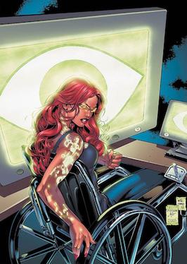
Batwing #1, Written by Judd Winick, Art by Ben Oliver.

Green Lantern #1, Written by Geoff Johns, Art by Doug Manhke & Christian Alamy.

Green Lantern Corps #1, Written by Peter J. Tomasi, Art by Fernando Pesarin & Scott Hanna.

Animal Man #1, Written by Jeff Lemire, Art by Travel Foreman & Dan Green.

Frankenstein: Agent of S.H.A.D.E #1, Written by Jeff Lemire, Art by Alberto Ponticelli.

Swamp Thing #1, Written by Scott Snyder, Art by Yanick Paquette.

Demon Knights #1, Written by Paul Cornell, Art by Diogenes Neves & Oclair Albert.

Resurrection Man #1, Written by Dan Abnett & Andy Lanning, Art by Fernando Dagnino.


PullList_Sept25

I think all of them are first prints—the ones that matter at least I know are. Still on the hunt for Detective Comics and Wonder Woman, but I’m pretty sure they’re all sold out around the GTA, Toronto for sure since I’ve been to both Silver Snail and The Beguiling and coming up empty handed this week.

It started with Justice League and Flashpoint #5 at the start of the month, and now we’re three weeks in with most of DC’s new titles selling out in a day, if not sooner. Which is great for the industry, bad for me. Still, looks like all wheels are go on this initiative. And I’m still looking for grabs, so DC’s doing something right.

Going to do some more reviews on my grabs so far, but all-in-all, I’ve been careful with my grabs in making sure they’re worth it, all others I just download because I’m poor. All the Jeff Lemire (Animal Man, Frankenstein) and Scott Snyder (Batman, Swamp Thing) are probably going to be subscriptions from me.


Batwoman is a definite, you just can’t find that kind of art anywhere else. Both Green Lantern books are looking good, and GLC just has that ‘space epic’ feel I can depend on—I’d much prefer that over Legion Lost #1 or Legion of Superheroes #1 and their more closed-off and teen feel (but still looking forward to testing out Teen Titans #1 next week for my teen book fix).

So, there’s my proof. I’m a legit geek. I’m looking at you, Sheldon.
Don’t need some stupid quantum mathematics knowledge to get some geek gratification. Fuck laugh tracks, buy comics.

Wednesday, September 7, 2011

Comic Reviews!: Animal Man, Batgirl, Swamp Thing

Hey, hey, hey, guess what? Reviews are coming back.
Yeah, they basically change with whatever I’m into at the moment, and I’ll admit I don’t usually review things unless for something else (ahem, WILDsound those eons ago), but god damn it, it’s new comics.

AND I LOVE ME SOME NEW COMICS. 

Might do some more movie/television/book reviews. Like always, read this blog with a grain of salt. Except for what’s below. Follow it to the letter.
----------------------------------------------------------
Every Wednesday in North America, in comic book stores everywhere, is comics release day. Like how movies are usually released on Fridays, comics have a particular day that publishers send their books out to stores to go on sale.
This Wednesday, out of the dozen or so comics that DC Comics released, I only got three (but now I definitely plan to get more). I’ll just cut to the chase. DC is re-launching 52 of their comic books this September with all-new Issue Ones.
Some big names released today, but I went on the fringes and got some that I always wanted to get into—which is the real point of this entire initiative.
BATGIRL #1
image
One of the two Batman titles releasing today, I decided to pick this one up because I’ve always wanted to see Gail Simone’s work on other titles like pre-launch Secret Six.

I never got around to it, which I regret, but the re-launch gives me a chance to sample some of her writing, which I’ll admit doesn’t astound me like it’s hyped up to be given what I see on forums, but it’s definitely up there on quality.

The internal dialogue is a big hitter with this one.
If you get comics and read them frequently, you realize how important internal dialogue is to characterization, especially in a solo title. Gail knows how to write women, and I don’t think it’s solely because she’s one of the rare lead writers that is female, I just think she gets the character of Batgirl. ‘Getting’ a character is a loaded term, but it’s a necessity for a writer to engage with the story they’re telling. And that’s happening in this one.

Barbara Gordon, aka. Batgirl, has been paralyzed for three years, as the continuity regarding her wheelchair escapades has been kept. Controversy prior to launch day regarding how her miraculous recovery has swept the web, and the big question—probably the final say on whether this issue one is worth it, is how Simone writes it (or ignores it) in the book.

I want you to read it for yourself, but if you’re a new reader, you need not worry, the information of her past is front and centre, and well composed into her characterization, visually and narratively.  The best part is, if you’re familiar with Barbara Gordon, it’s even better. Really intuitive way to keep her grounded in who she is, combined with essentially a completey new identity with his relaunch.

It was a good taste for me into Barbara Gordon as a character. She was done right in this issue. On the fence for a monthly pick-up, but a good start. And Simone leaves nothing under the table, which is expected of a writer of her capacity.

Check it out.

Forgot all about art; I’m writing this on a whim. Ardian Syaf makes it action-packed, poppy, and clean. Easy on the eyes, like it should be.

SWAMP THING #1
image
Been following this one closely since it was announced, and pretty hyped. The comics master/completely senile old man that is Alan Moore gave the green giant comic book fame, and the decision to re-launch him with Supes, Bats, and the rest, is a respectable decision (one Moore is cranky as usual about). Gives me a chance to finally get into Swamp Thing; again—something I’ve always wanted to do, that this re-launch lets me do.

I won’t summarize it for you, but basically it revolves around a botanist who died developing a flora-saving compound, and resurrected as a creature composed of plant matter with sentient thought, and the memories of this man. That was before this rewriting of origins. What struck me is that this starts off with Alec Holland, the man instead of the creature, and focuses on him in detail. The decision to bring Holland back to Swamp Thing stories (he was absent for most runs of prelaunch Swamp Thing) was a nice turn. It represents a true retracing of steps back to the core of the comic character and its mythology.

This is a comic that’s dialogue-heavy, but has a nice cameo interaction that, I think, connects it closely to the entire new DC Universe within these 52 comics. Really nice to see that Swamp Thing’s importance is represented in these interactions with big name characters.

This is all thanks to Scott Snyder, responsible for American Vampire—an award-winning series. In interviews he’s cited Moore’s run on the comic as a big influence, and if I read Alan Moore’s run (sadface), I bet I’d agree. The dialogue, while heavy, gives a lot of presence to Holland as a character, plus its exposition was a treat, since I never really understand what’s behind Swamp Thing—that’s a new reader standpoint.

From the art, I can gather the ‘dark’ side of the new DC pretty well from Yanick Paquette’s artwork. To me, I get a sense of the range of artistic styles throughout all these artists working on the 52 books. The villain reveal is a real treat, I can say its definitely dark, and quite literally, twisted visuals. It balances out with clean and bright colours, but when it does go deep into the supernatural, it delivers.

Not really any negatives, since I’m treading new territory, and it’s engaged me on a level that makes me really want to see where Alec Holland and his troubles with chlorokinesis go. Snyder immerses me with the dialogue, and Paquette drags me into the world with those swell visuals. Could definitely be a monthly pick-up.

Check it out.

ANIMAL MAN #1
image
Animal Man is one the other ‘Dark’ line of titles coming out of the new DC. And damn, did it hook me on this line. Probably the most hyped ‘fringe’-style book on the web, it did not disappoint anywhere, I don’t think.

Jeff Lemire is some new talent, coming straight out of Toronto for one thing, and his Sweet Tooth project, I hear is worth the endless reads. When it comes to Animal Man, shot from C-list status into the DC front-line by writer superstar Grant Morrison in the 80's, I had a feeling from the news and previews that Lemire was going to take this book to some crazy places, much like many think of the prelaunch Buddy Baker and his numerous adventures.

Within the first three pages, I was seeing some quality writing, and some striking, unique artwork by Travel Foreman. The way it starts out too, is unconventional to say the least, but for an Animal Man new reader, it worked very well. I’ll let you read for yourself when you pick it up, but it perfectly summarizes what I need to know in order to get with this book, and it did it in a way that seamlessly blends into the narrative. It engaged me right off the bat, and I got to know this character in one page.

From there, it’s easy pickings for Lemire. He knows Buddy Baker, and his writing shows it. It was naturalistic dialogue coming into my head easily, and by the time the action starts, the artwork by Foreman signifies a narrative change that the writing almost has to catch up with—like the naturalistic feel is leaving Buddy Baker’s life at that moment, and he as to deal with something pretty unnatural by the middle of the issue. You can clearly see it in the intricacies and technical details of Foreman’s art.

By far, this is my favourite of the three. If not only that it’s unlike any other superhero comic I’ve read in a while, it combines generic elements from horror and fantasy and just crazy stuff that’s even outside a cape comic’s norms—and that’s saying a lot—but it’s what you’d expect from the 'Dark’ titles of the New DC.

And that villain reveal, it gave me chills. Foreman’s artwork shines most here. Lemire’s carried the character the whole way, and plops him right in front of some twisted shit that puts the cherry on top. And the ending is like putting another cherry on top.

That’s two cherries. It caught me from the start, and dragged me into a story that I don’t think I can get out of. You start feeling a little of what Buddy Baker might be, and it gave me goosebumps. I hope it gives you some too. This is alternative/counter-culture/’contemporary-style’ comics given a new spotlight. Morrison should shake Jeff Lemire’s hand, because this comic is in good hands.
Definitely going to be following this awesome comic book. Check it out.
------------------------------------------------------------
Alright, that’s it for now. Three comics that were definitely worth picking up, which is a good thing because it lessens the blow of the cash I freely give to the comic book overlords. Not an addiction people, creative resource.

If I had bad reviews on a comic, then I’d regret buying them. And that sucks. So they’ll probably be good reviews. Sorry for the lack of variety.

Go to your local comic book store and ask about DC’s The New 52. Hell, ask about what’s happening with Marvel if you feel so inclined. And guess what, you can buy them online, and read them on your computer. No creepy fat guys accosting you.

Just buy some damn comics—the ones above, or any others that catch your eye.
Happy hunting.

[no, there probably won’t be posts about not-comics for a while.]

Sunday, September 4, 2011

“Why Read Comic Books?”

A web column By Martyn Pedler, on Bookslut.

Sometime back around 2004, geeky Seth Cohen became the unlikely heartthrob of teen soap The O.C., relegating the traditionally dreamy Ryan Atwood to sidekick status. If I was forced at gunpoint to pick the exact moment that comic book reading lurched into the mainstream, this might be it.

In this post-Seth world, however, convincing someone to read a comic is more like getting them to try a new band than getting them to admit that “music” as a whole might be worthwhile. If you’ll forgive my apples-to-oranges comparisons and rah-rah cheerleading, here are some random reasons why I read comics.

Starting big: comics can do anything. (Cancer? Cured!) Without limitations like sets, makeup, or special effects, comic art encourages the transformation of subjective reality to objective reality. The art can feel like it’s coming directly from the artists’ sticky subconscious to the page. It’s also why the best horror comics always feel like nightmares; like drawings that require a child to be sent home early from school.

That’s because they feel less mediated, too, thanks to the illusion created by pencil, ink, and especially lettering by hand. Of course I know most comics are mass-produced, and yet that illusion remains -- the odd notion that what you’re holding could be the only and original copy, made just for you. (Even the most idiosyncratic novel is still obviously typeset, right?) Comic books are an especially intimate artform, and many autobiographical comics succeed by exploiting that sense of reading someone else’s diary.

I won’t begin to explain -- or, frankly, entirely understand -- the mechanics of how sequential art tells stories and make motion. Writer and editor Dennis O’Neill once wrote that “a comic book world is a world lit by a strobe light,” and how that hypothetical strobe is used varies wildly from artist to artist.

Exhibit A: the animal-like characters of Norwegian artist Jason. They don’t seem to move like other comic stars. His precise art seems to capture them in the most awkward moment between two events, showing them frozen, deadpan. Jason’s been compared to Buster Keaton -- high praise, but warranted. At one point in his chess-themed western Low Moon, someone’s so surprised their hat flies off their head, and yet it seems to hover in the air like a bemused UFO.

Exhibit B: Jack Kirby, the King of Comics. Writing on “why read comics” without mentioning him would be cause for revolt, as he’s responsible for much of the visual vocabulary of superhero comics to this day. His men and women are drawn in such energetic poses that they exude dots of extra ink -- the famous "Kirby Krackle" -- and I always imagine the simple act of standing like statues in each panel requires herculean effort. Tensing every augmented muscle, they stay frozen until the moment I look away, turn the page, and they leap back into action again.

(A quick, tangential rant about “motion comics.” More and more, comic companies are hoping to supplement sales by offering digital versions of their titles with limited animation and voice acting that sounds like a first take at best. They think it’s just adding a gimmick to an existing story, like, say, slapping 3D on an old film. What they don’t understand is that forcing this motion onto sequential art actually breaks something fundamental about comic book storytelling. It suggests a group of executives throwing a comic on the ground and poking at it with sticks. “Look!” they say, jabbing at the page. “It’s moving! It’s moving!”)

Returning, then, to my scheduled evangelism. Once thick comic collections are sitting on your shelf, it’s easy to forget that these stories were ever presented in any other way. I was surprised to hear that Daniel Clowes’s latest tale of misanthropy, Wilson, was his first true graphic novel -- everything else had first been serialized. Why buy individual issues when, more and more, everything is out in collected editions soon after? And sold in respectable bookshops? It’s not just the credibility of comics that’s made them more accessible; it’s this newfound ubiquity.

Focus too much on the package, rather than the content, of comic books makes me feel like one of those people who decries e-books by reducing reading to physical objects and waxing lyrical about how paper smells. (You’d swear they snort up every sentence like cocaine.) But I do believe design and narrative sit together more closely when it comes to comics. Adrian Tomine asked that his earliest Optic Nerve comics, once found in a fancy collection, could be reprinted as the photocopied mini-comics they were always meant to be. He explains why in the new introduction:

The format -- the very thing that tempted me in the first place -- seems too professional, too aggrandizing for the material. […] Maybe I’m wrong, but I feel like there’s a different criteria that we apply to a little Xeroxed pamphlet versus a fancy-pants book, and in the translation from one iteration to the other, these comics of mine suffered.

Similarly, Jeffrey Brown’s heartbreaking novella, Every Girl Is the End of The World for Me, has just been collected in a larger book -- but it just won’t feel the same as the original version. Its scribbled pictures and shaky text sit in the palm of your hand. If the idea that a comic has been drawn just for you is an illusion, Jeffrey Brown’s so good at it that he could have his own Las Vegas magic show.

As comic book collections crept into those respectable bookshops, they were inevitably lumped together under the banner of graphic novels, no matter what sort of stories they might be. Autobiographical indies sit next to hysterical manga teens next to sequential art documentaries next to corporate-owned superheroes. As annoying as this might be, it accidentally highlights how comics possess unheard levels of generic bleeding. When a movie or TV show does a “western in space,” it’s a high-concept hybrid. When a comic book has frozen World War II soldiers, Norse gods, billionaire inventors, and gamma-powered monsters fighting side by side? That’s just business as usual.

Let me get my pom poms for the big finish. Ready? I love the strange split between stillness and motion, action and contemplation, that defines comic book reading for me. I love the inventive pages-as-puzzles techniques used by Chris Ware to illustrate angst in Jimmy Corrigan or that J. H. Williams employs for his spectacular action in the recent Batwoman-starring Detective Comics. I love the stylistic tornado of Grant Morrison’s conspiracy-fuelled series The Invisibles, and how it somehow made meaning out of its dozens artists using a dozen techniques.

I’ve run out of room to mention the pleasures of serial storytelling; the addictive fun of cliffhangers; or the sheer scope and dependable insanity of superhero stories. One last thing -- I love word balloons. When it comes to prose, I’m with Elmore Leonard. Almost any word used to describe dialogue delivery other than “said” makes me wince -- but the shifting shapes and sizes of word balloons are a wonderful thing. Growing, shrinking, dotted lines for whispers, icicles for dripping sarcasm. By combining the verbal and visual into something ridiculous, effective, and unique, word balloons serve as shorthand for comic books as a whole.

Right now, as I’m putting the final touches on this column (mostly involving kicking myself over all the books I promised myself I’d mention that didn’t make the cut) it’s August 28. It’s been declared the first annual Read Comics in Public Day:

Let strangers see you reading a piece of sequential art. Take to the streets. Be proud. If someone asks what you’re reading, say, "a comic book" (the phrase "graphic novel" is also acceptable, but let’s face it, it sort of defeats the whole purpose).

I’m for anything that generates sales for artists I admire, and it’s sweet to choose Jack Kirby’s birthday, too. But call me Pollyanna, call me naïve, call me blinded by Seth Cohen’s charms -- it feels about a decade too late for a rallying cry like “be proud.” The same could be said for everything I’ve written here. I can see the headlines now: “Biff! Kapow! Comic Books Worthwhile After All!”

Why read comics? As with all art, there’s only really one answer: why not?

Pretty much embodied everything everyone should take from reading a comic book. Wish I could write it as well as he does, but hell, I’m not a web columnist so whatever. Still, I think I did a pretty good job on my end. 

[via Bookslut]