Here’s the rest of my posts for my Inspiration Collections for BDC963!
Logo: Teletoon
What I like about television logos and branding is that there's sort of an active action-and-response in relation to the content that a certain channel will put out there and the branding changes that usually follow content changes. The fun part is noticing that a channels' branding has changed maybe, and for me, that's a prompt to kind of examine the new feeling or identity that is reflected in a channel's content from a branding initiative: a new logo is both the indicator, and that representative of those changes.
Teletoon's branding change pushed forward a bigger emphasis on new content, especially Canadian content, distinct adult programming blocks, generally higher-productive value programs, and other stuff I've recently seen that compare very differently to the Teletoon of a few years ago (I'm a big watcher). This logo's main features are the big blocky typeface, the 3D element, and the simplified and bold colours.
Teletoon does a good job of representing their change in content through their logo--it's streamlined, simplified, and direct. It's a broad logo, visually and conceptually. It can be taken in by kids as well as adults, a good reflection of the direction they went in with their programming. The 3D element provides that 'punch'--the boldness that the channel wants to emphasize to separate them from other networks. It generates a sense of loudness without being obnoxious visually, simple, but very present to the eye. The lighting effects are a good technique to emphasize the shape and colour of the 3D object; giving the depth it needs to have that visual punch. The colours are bright, but toned down. I feel like this logo is all about subtle personality, it's a really implicit and clever way of approaching a logo for an animated television channel. It's smart and fun.
Website: Vimeo
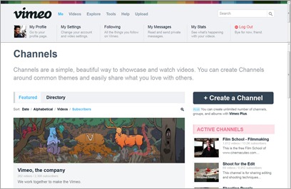
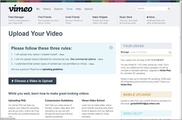
Vimeo's new web layout feels like somebody sprayed some cleaner on it and wiped and polished it with a lot of care. Most of the changes are really minor and subtle, but together there seems to a lot of change in the user experience and the flow of the site. There's an improvement in functionality and direction for the user, the designers have given more of a focus on encouraging users to interact and submit content since the site depends on it.
The revamped system of showcasing user content through a revised Channel to imitate something like how Youtube is doing, giving a sense of 'television' style of offering content that can be organized and presented is a good way to give a more user-focused experience.
The design is really white-based, streamlined in the visuals and gives minimal need to read into the content before the user has enough to understand what to do. It's clean and clear in its purpose, and has a lot of framework devoted to giving the content the chance to be seen by the users, more so than the previous site did. The changes are subtle, and it takes a previous user of the old Vimeo to notice, but once I got using it I enjoyed the ease of experience in browsing other people's content and navigating around the different parts of the site with much greater ease.


No comments:
Post a Comment