Logo: Toronto Blue Jays Baseball Club

Toronto’s team logo has gone through constant change through the years—their previous one was a far departure from the looks of the team since they started out, with a heavy reliance on blacks and greys, maybe to give an ‘edgier’ feel to the brand. This new rebranding is all about tradition to me.
It’s a good example of approaching the design in a very focused, very goal-oriented way; they placed audience first, the sports fans of Toronto, and probably planned meticulously in finding out how to get them excited about the Blue Jays for the upcoming season. The solution? Go back to the roots, to the classic look. I love the little tweaks with the shape of the jay, the baseball in the background and the reserved maple leaf. The logo actually has a lot of layered elements, but they fit together simple because we, as a culture, are accustomed to it.
The adage “Don’t fix what ain’t broke” would work well here. There’s a return to the blue, an iconic colour for Toronto sports, at least in hockey and baseball, with different shades contrasted against a Canadian red, so we can identify quickly the pieces that make up the branding and the team.The tyepface here is very ‘retro’, but it doesn’t feel tacky, it just feels classic. There’s a good feeling all around when I see this on a hat, or a jersey, or a shirt—it evokes emotion through tradition and understanding of audience, all told in a simple rebrand.
Website: Second Story Interactive Studio
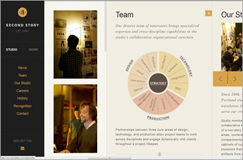
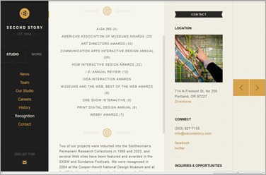
The most unique aspect of the site is undoubtedly the navigation structure. For an agency site that has portfolio pieces and needing to present its work in an intuitive way, they chose to give the user a new experience by designing a fantastic IA, one that you could experience two ways, through the side navigation bar or the floating buttons. And within that, each part of the site, almost acting like slides, has individual vertical scrolling navigation within. It’s a deep structural element that pushes this site into a more engaging experience, and gives the user a reason to look at the work, even if it’s just having to get there being done in a really cool way.
With the visaul elements, there’s also a feeling that I find departs from most designer’s websites, this one has a relaxed sophistication through the predominant cream colours and the linear nature (visually and structurally) to the site’s presentation. Everything’s muted and nuanced, and I get the feeling that Second Story wants to push that identity too. Their target clients are probably more in industries that need functionality and efficiency rather than visual flare. To that extent, Second Story does what any good designer’s site should: tell the user who they are by having them use the site.


No comments:
Post a Comment